In the 15th year of the Tops in- Trucks Fleet Design Contest, HVACR Business received a record number of entries and a marked improvement in the quality of designs from years past.
The competition was as close as it’s ever been, with many of the entries garnering respectable scores from the judges.
Company vehicles are the main source of advertising for many HVACR contractors.
And when that’s the case, the trucks better feature high quality, compelling vehicle graphics. HVACR contractors also must realize that an investment of several hundred to a few thousand dollars per vehicle means there’s little room for error.
Bold, simplistic designs dominated the field, making a lasting impression on the judges as they scored each submission.
Projecting the right image is crucial for positioning yourself in the marketplace and establishing brand identity. Nowhere is image more important for a contractor than on its most valuable asset — the fleet.
Clean design, legible, eye-catching, great layout, strong colors — these are descriptions that describe all of this year’s honorees.
Above all, however, the 2021 Tops in Trucks Fleet Design Contest winners, runners up and honorable mentions featured fleets that are simply outstanding.
WINNER
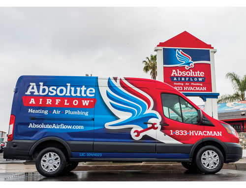
Absolute Airflow
Westminster, Calif. | 50 vehicles
Victor Rancour, owner
When Victor Rancour started his business, Absolute Airflow Plumbing, Heating & Air Conditioning, in 2018, he got his logo from a low-cost graphics service online. He thought it was good enough and didn’t give it a second thought as his company began to grow rapidly.
“We grew to a $5 million in the first year, so I thought everything was good,” Victor says. “I thought our logo was good too, until I ran into Dan Antonelli from Kickcharge Creative at Service World Expo.”

Antonelli, who had been following Absolute Airflow on social media, was complementary — but also honest — when he spoke to Victor.
“He acknowledged how well my company was growing, but said that my logo was terrible,” Victor recalls. “He told me to give him a call when I was ready to get a real brand.”
A couple of months passed before Victor, who kept that passing conversation in the back of his head, decided to act.
“I was like, you know what, I want to grow to be a $100 million business quickly,” he says. “And I want to make sure we had the right look.”
He called Antonelli and worked with Kickcharge on a new brand identity and truck design. The two of them worked together and within a few weeks, they came up with a winning design.
“I trusted Dan and gave him a rough idea of what I wanted,” Victor says. “The whole process was fast, and I was really happy with the new design.”
Having just wrapped about 20 of his trucks with his old logo, Victor made the decision to quickly reverse course.
“I decided to just pull the band-aid off and redid all my trucks right away,” Victor says. “I got new signs out in front of my building and redid all the branding for the company.”
The result has been phenomenal. The mixture of colors stands out and really pop on his fleet of more than 50 Ford Transits.
“The customers love it, and employees love it too … it really makes people want to work here,” Victor says. “It has been very well received and my only wish is that I had done it sooner.”
WINNER
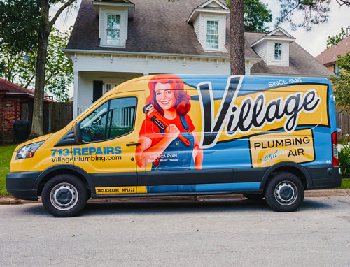
Village Plumbing & Air
Houston | 45 vehicles
Monica Ryan, owner
Village Plumbing & Air has been around since 1946, started by Monica Ryan’s father. Monica, a master plumber, bought the company from him in the 1980s and has been the face of it ever since.
“She’s very much the visual of the company,” Kelli Victorian, marketing manager, says of Monica. “She has always been the focal point of our television and print ads, so it just made sense to make her the focus of our trucks as well.”
Victorian worked with a local marketing company to create the design using a photo-realistic caricature based off a photo of Ryan holding a wrench. She then blew up the logo as large as possible to accompany the image of Monica.

“Our logo itself is very square and has a lot of elements,” Kelli says. “I had many versions of designs that I went through and just couldn’t get it to look right balanced with her, plus the phone number and all the elements I needed.”
The result is a stunning logo that covers almost the whole truck, with a large, friendly image of the female master plumber owner as the focal point.
The colors, too, were something Kelli paid close attention to so as not to stray from the company’s history.
“We’ve gone through a lot of logos over the years,” Kelli recalls. “We’ve always used blue and yellow, but in the past, they’ve also used maroon.”
Previous truck designs used photos with tag lines, but none of them were consistent.
“There were probably 10 or 15 different designs,” Kelli says. “They did all kind of match because they have the same theme, but each one was unique to itself.”
The new, winning design is currently emblazoned on 30 of the 45 vehicles in the Village Plumbing & Air fleet, making for a consistent marketing message.
The response from employees has been enthusiastic, and the community has responded well too.
“Our call volume has steadily increased year after year since we made our branding upgrades in 2018,” Kelli says.
RUNNER UP
Cool Techs
Linden, Va. | 5 vehicles
Jason & Stephanie Wadel, owners
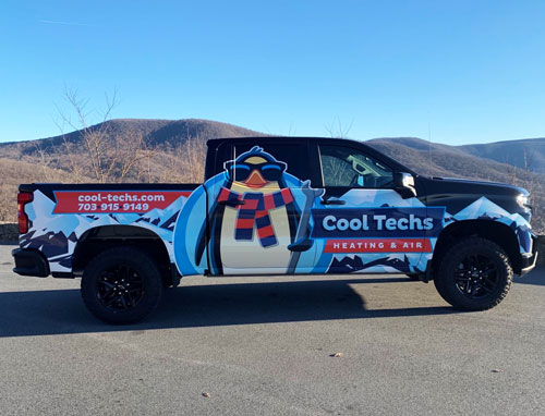
When Jason and Stephanie Wadel purchased a new Chevy Silverado Trailboss for their business, Cool Techs Heating & Air, they wanted to make sure it really stood out. So, they turned to Dan Antonelli and Kickcharge Creative, who they had worked with in the past to come up with their penguin logo.
“We knew we wanted bright but bold colors that would make us stand out and let me tell you, it’s impossible to miss this super cool design coming down the road,” Stephanie says. “The black background with the blue snowy mountains really helps show off the colorful penguin and banner.”

With their business and home both surrounded by the beautiful Shenandoah Valley mountains, the Wadels wanted to be sure Kickcharge incorporated their “back yard” into the design of the wrap. The penguin, too, was an important element.
“Penguins are known for their long-lasting relationships with their mates, and really, that’s exactly who we are,” Stephanie says. “All of our customers, we want to be their long-life partner for their home. So, we thought it was perfect.”
Previously, Cool Techs had a logo and design that Stephanie admits was “generic.” But after three years in business, the Wadels knew they needed to do something to stand out.
“We knew that we wanted to make ourselves different than our competitors and having a full wrapped design was definitely something that we wanted,” Stephanie says. “As soon as we changed to a bolder brand, I mean, the recognition hasn’t stopped. Our customers love our new design.”
RUNNER UP
Western Heating and Air
Orem, Utah | 32 vehicles
Ryan & Angie Snow, owner
Ryan and Angie Snow, who started Western Heating and Air in 1995, have grown considerably over the years. Their original branding and color scheme did well for them, but they realized last year that it was time for an upgrade.
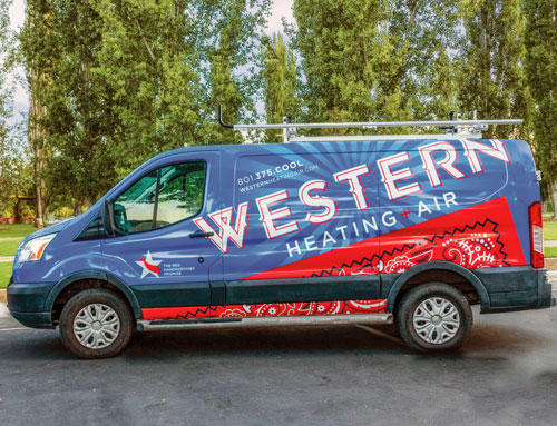
“We wanted to remain loyal to the original color scheme but give it a modern look,” Ryan says. “But we also wanted something that could tell our story.”
Having grown up on a farm, Ryan remembers that his dad always carried a handkerchief in his pocket.
“He would use it to wipe away the blood, sweat and tears of a hard day’s work,” Ryan says. “Now it represents the values that were taught on the farm: hard work, integrity, doing things right the first time.”

To convey these values in their branding — with the red handkerchief as a focal point, the Snows worked with the design company Redkor.
“We were very involved with Redkor and together we built the new brand,” Ryan says. “We rebranded the entire company. The marketing campaign was first, followed by the electric sign on the building, then the vehicle wraps and the new website.”
With an investment of a little more than $80,000 just in vehicle wraps for his fleet of 32 vehicles, Ryan has already seen a return.
“The consistency of it is turning heads and our call volume has gone up,” he says. “Customers love how (the trucks) stand out and how they tell the story that makes us unique … the red handkerchief is unique to us and it promotes our values.”
HONORABLE MENTION
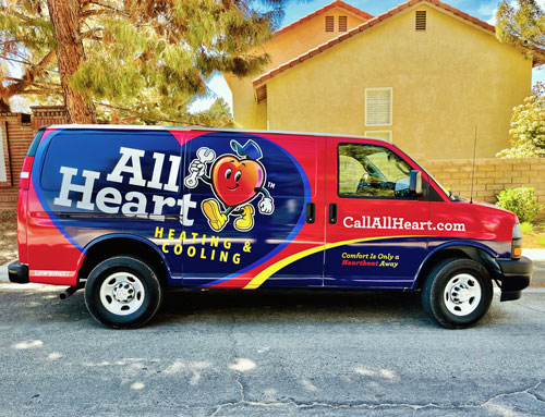
All Heart Heating and Cooling
Lancaster, Calif. | 14 vehicles
Dylan Rucker, president
At the end of 2018, Dylan Rucker was exiting a partnership for his company, DS Heating and Air Conditioning. At the time, he wasn’t considering a name change.
“What really changed was, I was in the office one day listening in on a phone when someone asked what ‘DS Heating and Air Conditioning’ stood for,” Dylan recalls. “And the person answering the phone didn’t know … and that was my fault, because I didn’t teach them.”

After focusing on his own leadership, Dylan realized that the name, which was personal to him, didn’t represent the company. So, he decided to completely rebrand — starting with the company name.
“We want to represent something new in our community that seemed to be lacking,” he says. “With all that was going on in the country — the pandemic, the election — we wanted our neighbors to know that we’re here for each other.”
One suggestion that stood out and stuck was All Heart Heating and Cooling. With that idea in mind, Dylan turned to Dan Antonelli at Kickcharge Creative to turn that into a bold, brand and beautiful design for his trucks.
“He asked me ‘What exactly is your primary focus?” Dylan says. “I gave him a breakdown of what we wanted to represent and he says, ‘I have this idea of this little heart and I’d like to go off of that.’”
From there, the Heart mascot was born and with it, a complete rebranding that stands out from the competition and represents all that Dylan and his team stands for.
HONORABLE MENTION
Arizona Comfort Specialists
Phoenix | 4 vehicles
John and Kathi Miller, owners
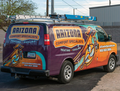
Sometimes, a good idea comes from the most unlikely of places. Such was the case for John and Kathi Miller, owners of Arizona Comfort Specialists.
“One of our local competitors, with whom we have a business relationship, recommended redoing our brand because it was kind of bland,” John says.
“We saw what Kickcharge Creative has done in the past and it looked like a really good thing to do because our marketing was kind of floundering.”

The company name, Arizona Comfort Specialists, stayed the same, but everything else about the brand is new, from the colors to the roadrunner mascot.
“That was all Kickcharge … they took a lot of information from us, given our location and what we do, and sent us a couple of proofs and we kept fine tuning it,” John says. “And that’s what we ended up with.”
To help with the rollout, the Millers used their other marketing materials.
“We put the trucks out on the roads and featured them in our newsletter,” Kathi says. “After they were wrapped, we put pictures of the new trucks in the newsletter and let our customers know to be on the lookout for our new look.”
The most rewarding aspect of the new look, of course, has been the reaction from customers.
“We’ve gotten a lot of good feedback from just people around town,” Kathi says. “They’ll call us up and say, ‘Hey, we saw your truck in our neighborhood. Love it,’ and, ‘Hey, can you guys come and service my AC?’”
HONORABLE MENTION
Georgia Air
Richmond Hill, Ga. | 3 vehicles
Chad Bird, owner
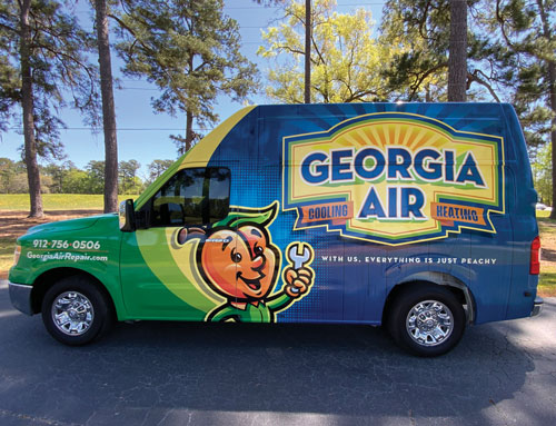
Sometimes, when coming up with a new brand, the obvious choice is the best choice. That was the case for Chad Bird, owner of Georgia Air, who consulted with Dan Antonelli of Kickcharge Creative.

“Dan and I came into this with the same logo idea, he just made it come to life for us,” Chad says. “We both agreed on the peach idea and the Kickcharge team went to work.”
While Chad readily agreed on the giant peach logo, the rest of the creative process wasn’t as easy for him.
“Talk about a pain point! We did a competitor analysis and went outside the box,” Chad recalls. “Dan took me well out of my comfort zone, but now I am so thankful I listened.”
While the design is fairly new — implemented in March of this year — Chad says they’ve already received a lot of attention.
“My wallet hurts but the excitement and brand we have to stand behind is more than worth it,” Chad says. “This is part of a larger branding initiative; the logo and mascot were our first task.”
Once that was created, Chad says they started on the vans, cards, equipment stickers, brochures, folders, magnets and other items.
“Who doesn’t love a happy peach man named Fuzzy?” Chad asks. “I think (the fleet) is unique … from the Georgia Air logo to the peach man, the wood grain background to resemble old peach crates, to the tag-line, to the colors — it’s a head turner and a very sticky brand.”
SPECIAL MENTION
All Pro Plumbing, Heating, Air & Electrical
Ontario, Calif. | 88 vehicles
Richard Black, owner
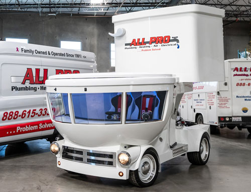
Back in the year 2000, Richard Black, owner of All Pro Plumbing, Heating, Air & Electrical, was enjoying a few cold ones with his engineer friend, Manny Medina. Together, they came up with an idea that started as a joke, but quickly became a “what if?” — a toilet car.
Richard wanted to find a way to bring together his love for cars, his passion for plumbing, and his desire to do something special for his community.

The vehicle was custom built from the ground up. Richard and Manny spent the last 15 years bringing their vision to life and in 2020, the 11-foot-tall, pristine Toilet Car made its big debut in Ontario, Calif.
“We at All Pro take the betterment of our community very seriously,” Richard says. “Whether achieving our goals takes delivering premium-quality plumbing, electrical, or HVAC services or driving around in a toilet car, you can trust us to do it all with pride and maximum enthusiasm.”
In addition to being a unique, head-turning vehicle, the toilet car features a premium stereo system, A/C, high-tech lighting, a flushing handle, five state-of-the-art cameras and five high-definition screens. It also has a hydraulic toilet lid, porcelain door handles and a vanity plate that says, “FLUSH-IT.”
“All truck designs, while functional, need to get your branding recognized and remembered,” Richard says. “The toilet car ranks with the Oscar Meyer Wienermobile.”

