This year’s winners — Comfort Cavalry Heating & Air, Comfort Matters Heating and Cooling and Zen Air Heating & Cooling — showcase fleet designs that set themselves apart from the competition.
Visibility goes a long way toward keeping your company top of mind, and there’s no better way to market your company than through your fleet of vehicles.
Now in its 14th year, our annual Tops in Trucks Fleet Design Contest celebrates excellence in design, creativity and the contractors who embrace this bold form of marketing.
“This year’s winners have a complete common theme across their fleets: Bright and bold, easily recognizable branding” says Joseph Kalinowski, creative director for the Content Marketing Institute. “In addition, the large and identifiable logo or icon is paired with minimalistic copy. The company’s pertinent contact information is unencumbered and placed where the eye can easily be drawn to it.”
Brightly colored, attractive vehicle wraps make your company vehicles stand out from all the other cars on the road. Unlike radio ads or print ads that interrupt a potential customer, a well-done truck design attracts attention without disturbance. Customers can easily spot your message without distraction from what they’re doing.
Branding can be expensive — but it doesn’t have to be. Many contractors have found that investing in fleet branding is an easy and affordable way to get their company’s name in front of potential customers … as long as it’s done right.
“When looking at this year’s fleet winners, if their vehicle is parked outside a residence or driving down the road, the first thing that would draw my attention is their logo/icon and bold colors,” Kalinowski says. “Notice that each of these vehicles have a logo that serves as a large focal point on the vehicle. The winning designs recognize that brand recognition is key.”
WINNER
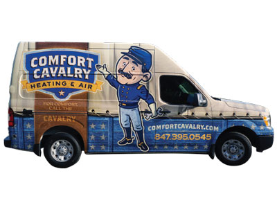 Comfort Cavalry Heating & Air
Antioch, Ill. | 6 vehicles
Kevin & Emily McGrath, owners
Branding that may work for you when you start out as a small, local company might not translate to who you are as a company when you begin to grow. That was the case for Comfort Cavalry Heating & Air.
“Our name originally was Antioch Heating, which is the town that we live in; and we really chose that name because we wanted people to think small hometown company,” says Emily McGrath, co-owner of Comfort Cavalry. “When we expanded, when we started hiring and getting bigger — because we’re right on the Wisconsin border — we’d get a lot of calls for people asking if we service Wisconsin.”
The growth and expansion of service area led the McGraths to the decision to rebrand this past August. Not to mention, a desire to work with Dan Antonelli from KickCharge Creative.
“I’ve been following Dan’s work forever,” McGrath says. “It really just felt like the right time to reach out to him when we did.”
KickCharge helped the McGrath’s develop their brand to pay tribute to being a Veteran-owned and -staffed business. The colors were chosen to reflect the uniform worn by the cavalry.
The judges appreciated the uniqueness of the overall concept and the attention to detail in the Comfort Cavalry truck design.
“I love the name and I love the plaque that Dan did with the name on it,” McGrath says. “It’s so put together and it’s nice because I feel like we really have a great brand that we’re able to communicate with people now better than we were with our last.”
After just six months with the new branding and trucks on the road, Comfort Cavalry saw a staggering 114 percent growth.
If they had to do it all over again, McGrath says the only thing they’d do differently would be to implement it a lot earlier. In fact, the best advice she has for any rebranding or truck design is simple: hire a professional.
“It’s an investment in your company and in your brand,” she says. “My best advice is do not cut corners … if you can’t do it and you can’t go 100 percent, don’t do it at all.”
WINNER
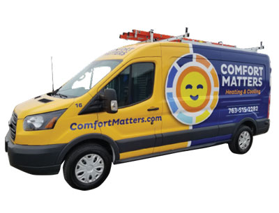 Comfort Matters Heating and Cooling
Maple Grove, Minn. | 14 vehicles
Corey Hickman, owner
Comfort Matters Heating & Cooling is a customer focused heating and air-conditioning company that was started with a strong focus in providing the best customer service and quality available. So what better way to convey that with their brand than a giant, smiling sun on their trucks?
“Our community can’t miss the smiling logo … it’s very positive,” says Corey Hickman, owner of Comfort Matters. “They love the look and they tell us it makes them smile.”
When in 2016 Hickman decided it was time for a new design for his fleet of trucks, he turned to a design firm he’d met at Service World Expo.
“We worked with Dan Antonelli at KickCharge Creative,” Hickman says. “In addition to the truck design, we also did a logo change at the same time.”
The judges loved the simplicity of the design coupled with the large, can’t-miss smiling sun logo that welcomes customers and potential customers alike.
Other than the big, bold smiling sun logo, the most noticeable aspect of Comfort Matters’ design is the striking yellow and blue colors of the van. Yellow is certainly a bold choice for an HVACR company, and it actually came about purely by accident.
“The first truck I had when I started the company came from auction, and it was yellow,” Hickman says. “The colors on our trucks now keep things new, which help us stand out from the competition.”
As far as a return on investment for wrapping his 14 vehicles in this winning design, Hickman says it has been great.
“Our brand has made an impact, not only locally, but nationally as well,” he says.
WINNER
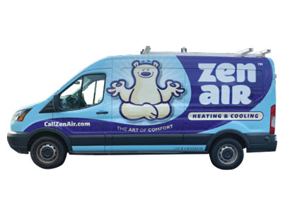 Zen Air Heating & Cooling
Suwanee, Ga. | 5 vehicles
Eddie McDonald, owner
Some companies rebrand simply because they feel its time for a change. Others, such as Zen Air Heating & Cooling, go through a rebrand out of necessity.
“I’ve owned this business for about four and half years,” says Eddie McDonald. “Previously, it was a part of the Temperature Pro franchise.”
A mere two months ago, McDonald left the franchise, but the new branding and the design for Zen Air was something he’d actually been working on for more than a year.
“There’s so many companies with, you know, Bob’s Heating and AC, or just the family name or whatever; I wanted something different,” McDonald says. “Then I started thinking along the lines of when people are in their home, what is something that represents the state that they want to be in? They want to be in an ideal comfort state.”
It was then that Zen popped into his mind and Zen Air was born. He jotted down all his ideas for the brand and started Googling ‘HVAC truck wrap design.’
“I looked at hundreds and hundreds of images, and almost every one that I really liked had been done by Dan Antonelli at KickCharge Creative,” McDonald says. “I got in touch with him immediately and we started working together.”
After telling KickCharge his ideas and color preferences, they came back to him with a number of different options from which to choose.
“All the ones they came up with were great,” McDonald says. “I wanted the design to convey that feeling of satisfaction, or comfort.”
Not surprisingly, the judges all agreed that the concept and colors for Zen Air are unique and stand out from any design in the competition.
His favorite aspect of the design, not surprisingly, is the polar bear. In fact, one of his technicians reported a guy walking down the road next to him, smiling, doing the little symbol with his hands that the bear’s doing.
“We’ve had a tremendous amount of positive feedback,” McDonald says. “I’ve actually been trying to come up with a name for the bear, but haven’t settled on one yet. I was thinking about making it a contest.”
RUNNER UP
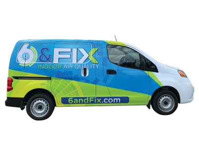 6 & Fix Heating & Cooling
Raleigh, N.C. | 43 vehicles
Nick Scarnecchia, owner
When coming up with a new brand for his company, Nick Scarnecchia decided to hire a marketing firm to conduct a focus group on what homeowners want most out of a company. The answer came back: immediate service.
“From that information, we decided to rename, restructure and rebrand our business entirely in order to provide same day service for HVAC repairs,” Scarnecchia says.
The concept is simple: Call before 6 p.m. and get same day service. It’s a promise boldly declared on the company’s website, accompanied by a countdown clock to 6 p.m. each day.
The name is not the only unique thing about 6 & Fix’s bold design … the judges also appreciated the color palette, which is something they haven’t seen in the competition before.
“Many HVAC companies use red and dark blue, to represent hot and cold,” Scarnecchia says. “We wanted to differentiate ourselves and use brighter colors that would stand out better.”
After spending a little more than $160,000 to rebrand the company with a new logo, point-of-sale material, website, then the trucks and all mass media advertising, Scarnecchia says they’ve absolutely seen a return on investment.
“We have been in business since 1987 and up until 2013 we only had 9 trucks,” Scarnecchia says. “Now, with our rebranding initiative, we have grown our fleet up to 43 trucks and so much more in annual revenue.”
RUNNER UP
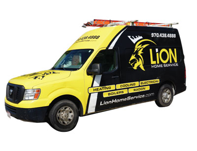 Lion Home Service
Fort Collins, Colo. | 39 vehicles
Barton Palmer, owner
One of the many positive side-effects to a new company brand is often a boost to company culture. That was certainly the case when the Lion Home Service brand was rolled out in 2018.
“There was a huge bonus to company culture when we rolled out the lion brand,” says Donja Medina, marketing manager for Lion Home Service. “The techs love the trucks.”
The initiative was a total team effort. One day, the team went out to dinner brainstorming names. Then, as everyone drove around town they took pictures of service trucks.
“We created a poster in the office with all the photos of area service trucks, and saw the market demanded a yellow and black truck,” Medina says. “Then we turned to 99Design and held an online logo contest.”
The winning designer was Fakih Amri from Artpaper, and from there it was merely a matter of wrapping the company’s 37 Nissan High Tops and two Peterbilt septic trucks with the bold, black and yellow design.
The judges were drawn to the simplicity and boldness of the design — something they believe also draws in customers.
“We track the phone number on the trucks,” Medina says. “In 2019, we tracked $40k in revenue directly to the truck phone number, and so far this year we’ve tracked $16k to date.”
RUNNER UP
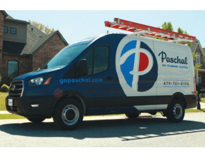 Paschal Air, Plumbing & Electric
Springdale, Ark. | 85 vehicles
Charley Boyce, owner
Charley Boyce is no stranger to the Tops in Trucks Fleet Design Contest. After taking ownership of Paschal Heat, Air & Geothermal in 2012, he hired an in-house marketing coordinator with a graphic design background to refresh the then 45-year-old company’s look.
The result was a Runner Up placement in the 2014 Tops in Trucks Fleet Design Contest. As Boyce continued to grow the company from that point, they seemed too to outgrow the branding.
“We had continued to experience year-over-year, double digit growth,” Boyce says. “We were building a new building; looking at adding plumbing and looking at adding electrical … we had a lot of momentum in the marketplace.
“We had a lot of brand awareness, but as we were going to move into the new facility, and as we were adding plumbing and these other divisions ... we couldn’t scale that old logo,” he continues. “We couldn’t just keep saying, ‘and plumbing and electrical.’”
That’s when he decided it was not only time to change the name to Paschal Air, Plumbing & Electric, but also to refresh the brand — including his trucks.
This time, he turned to help outside the company and hired Dan Antonelli and KickCharge Creative.
“We didn’t necessarily need a total clean slate,” Boyce says. “ We’re actually doing pretty well, but we just needed to freshen this thing up, bring it into today’s standards.”
The result was a refreshing updated to Paschal’s iconic “circle P” logo and traditional dark blue and cyan color scheme, all of which received high marks from the judges.
HONORABLE MENTION
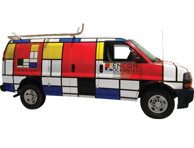 Encon Mechanical Corporation
Ocean Township, N.J. | 45 vehicles
David Indursky, president
When it comes to fleet design, it’s fair to say that mechanical contractors get to play by a different set of rules than residential companies. While branding is important, the amount of information required on a mechanical contractor’s truck is minimal, since they don’t rely on them as heavily for advertising.
Perhaps that’s why, when a mechanical contractor’s truck stands out, the judges get excited.
“We did a 360-degree rebranding in 2019 as part of our 50-year anniversary,” says David Indursky, president of Encon Mechanical. “The new logo came first and inspired all the other branding assets including a fresh new design of our offices.”
When it came to their trucks, Indursky says it was an interesting process.
“Our vans used to have a lot of words and stuff on them,” he says. “And as we worked with a marketing company, we came to the realization that we live in a world of people looking stuff up.
“They’re not reading our vans on the side of the road,” Indursky continues. “And before you knew it, we had big bold graphics.”
The bold graphics paid off, as the judges were pulled into the design and immediately wanted to learn more about the company based off the trucks.
Encon has invested approximately $41,000, and plans to wrap the rest of the fleet for a total spend of $133,000.
“We just launched the new fleet branding in March, however, as one of the largest fleets in our industry in New Jersey, we foresee a big return on investment in the out-of-home advertising with our technicians on the road 24/7 — especially using our strategy to cover the entire vehicle vs. just having our logo on one side,” Indursky says. “We also plan to integrate our fleets in our social media and other marketing efforts.”
HONORABLE MENTION
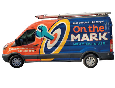 On the Mark Heating and Air
Streamwood, Ill. | 2 vehicles
Mark Portuese, owner
On The Mark Heating and Air began with the idea that treating everyone like family was not only the right way but also the responsible way to run a business.
Having implemented his new design on only the 15th of March this year, it’s too early to tell how much of a return on investment On the Mark Heating and Air will see … but if the initial impressions are any indication, Owner Mark Portuese will be very pleased.
“Customers love it and have told me several times that it looks like a national brand,” Portuese says. “I see heads turn everywhere I go.”
If turning heads and attracting attention is what Portuese was going for, then the judges agree that he definitely hit the mark with this design.
Poised for expansion, Portuese decided to begin with the branding and turned to KickCharge Creative to design his company’s look.
“Dan (Antonelli) selected our colors because they’re unique to our market,” Portuese says. “I love how the design is eye-catching and yet simple to the point … even the font was carefully selected to stand out.”
HONORABLE MENTION
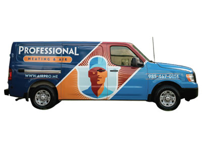 Professional Heating & Air
Hammond, La. | 13 vehicles
James Barras, owner
Since the Yellow Pages fell out of fashion, so too did putting an “A” before your company name. Perhaps that’s why the first suggestion A-Professional got when undergoing a rebranding was to drop the “A.”
“The name change took a minute for everyone to buy into,” says James Barras, owner of Professional Heating & Air.
“But now everyone sees the benefit of what we did.
The rebranding effort — which began with the name change and the vehicle wraps — was implemented about three years ago. Barras hired Graphic D-Signs, which itself has rebranded since then as KickCharge Creative.
“We have 12 vehicles with the design, which cost about $3,500 each to do,” Barras says. “But people call in now just because they see the vans everywhere.”
Simplicity and color scheme are two things the judges gave high marks for on this design.
It certainly would be difficult to miss the bright, bold design emblazoned on the company’s trucks — it’s simple, yet memorable.

 Comfort Cavalry Heating & Air
 Comfort Matters Heating and Cooling
 Zen Air Heating & Cooling
 6 & Fix Heating & Cooling
 Lion Home Service
 Paschal Air, Plumbing & Electric
 Encon Mechanical Corporation
 On the Mark Heating and Air
 Professional Heating & Air