Editor's Note: The HVACR Business Tops in Trucks Fleet Design Contest is an annual salute to outstanding fleet vehicle graphic design.
The 10th Annual Tops in Trucks fleet design contest proves that, when it comes to marketing, branding and professional image, HVACR contractors have stepped up their game in a big way.
The way you present your company has a profound impact on your business. If you think people purchase goods and services based upon rational thinking, think again. Most decisions are made based on associations and feelings — and the image you present goes a long way toward imprinting yourself on your customer base.
Projecting the right image is crucial for positioning yourself in the marketplace and establishing brand identity. Nowhere is image more important for a contractor than on it's most valuable asset — the fleet.
Now in it's 10th year, the Tops in Trucks Fleet Design Contest has received hundreds of entries and each year the judging panel's decision is more difficult than the last.
This year's winners continue to elevate the image of the HVACR industry — Hawks & Company, Innovative Air Solutions and Jon Wayne Service Company all present an image of innovation and professionalism through classic, yet refreshing fleet designs.
WINNERS
Hawks & Company
Deptford, N.J. | 21 vehicles
Marty Rosica, owner
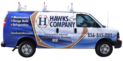 Marty Rosica, owner of Hawks & Company in Deptford, N.J., has always believed that, to be successful, it's important to surround yourself with people who are smarter than you.
"For me, that's been my ACCA mix group — the Masters of Achievement," he says. "They're the best of the best and they challenge me every day."
One of the bigger tasks they've challenged him with is in regards to his company branding. In particular, the look of Hawks & Company's fleet of 21 Chevy trucks and vans.
"When I visit those companies, I notice a lot of consistency in everything they do, from accounting to operations to branding," Rosica says. "Many in the group have done wraps for their vehicles, and it's paid off."
Rosica decided, after having owned the 40-year-old company for 10 years and growing it five times over (and adding more than 15 employees in that time), it was time to boost its image and come up with something new and refreshing with the branding.
"The design on our trucks is a part of a complete branding effort, with common themes throughout everything we do," he says. "The truck wraps are so new and refreshing, our fleet stands out like you wouldn't believe."
A 100 percent commercial and refrigeration company, Hawks & Company relies on relationships to drive business. All lead generation comes from being seen, so Rosica knew the look of his fleet would play an important part in obtaining new relationships and clients.
"We don't do cold calling, plan and spec work or bid through general contractors," he says. "We differentiate ourselves against the status quo, and being seen and remembered is a big part of that."
Rosica began by approaching a local design firm with his ideas. The company logo — a capital "H" encircled by a gold hexagon — was something he implemented when he bought the company in 2006. The rest of the design, he left to the experts.
"All I told them was that we want to be different," he says. "Our building is right across the street from a supply house, and I see all of our competitor's trucks every day."
After choosing one of the many design options he was presented with, Rosica's next challenge was implementation. Instead of investing in wraps for all its trucks at once, Hawks & Company is wrapping new vehicles as they're added to the fleet.
"The wraps do cost about six times more than the painted lettering we were doing," he says. "And my controller advised me to wrap new vehicles as we buy them, as we do turn them over on a regular basis … we add about 3-4 trucks every year."
So far, Rosica had two trucks wrapped this past January, with two more in the works. Overall, he is more than satisfied with the branding efforts, noting that his employees feel a sense of pride and know they're working for a company that wants to be better thanks to the investment he's put in to setting Hawks & Company apart from the rest.
Innovative Air Solutions
Mt. Vernon, N.Y. | 11 vehicles
Michael Carlo, president
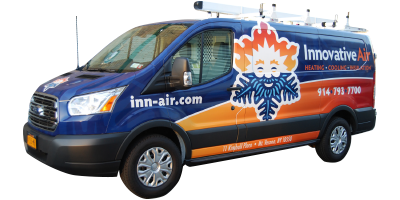 Throughout the years, many HVACR companies have used the traditional red and blue color scheme to represent hot and cold, as well as some embodiment of a sun and snowflake.
"That's been done to death, and I knew I didn't want those elements in my new company branding," says Michael Carlo, president of Innovative Air Solutions in Mt. Vernon, N.Y. "We've had a pretty simple design since my brother and I started the company in 2000, so all I knew was I wanted something detailed and catchy."
After having read past issues of HVACR Business and viewing Tops in Trucks fleet design contest winners over the years, Carlo decided to turn to Dan Antonelli from Graphic D-Signs to come up with something fresh for Innovative Air Solutions.
"Dan was very aggressive in throwing ideas at us, and they were all great," Carlo says. "But none of them really stood out as something I thought embodied our company."
Finally, Antonelli presented him with his take on the classic sun/snowflake logo and, Carlo admits, it wasn't his immediate favorite. But, the more he looked around at other companies, the more he realized just how unique it was.
"The logo and the colors are refreshing," Carlo says. "I didn't want red and blue, but the colors he came up with really fit with the refreshing re-imagining of that logo."
Located just 15 minutes north of New York City in the tri-state area — in the hub of one of the best residential markets in the country — Innovative Air Solutions is up against a lot of competition, so it's important that his fleet of 11 Ford vans and trucks stand out from the rest and makes a memorable impression is important.
"We compete with a lot of 'man in a van' operations who don't really need a lot of branding," Carlo says. "So not a lot of HVACR companies in the area have really done anything like we have with the graphics and branding.
It's obviously making an impression, as Carlo notes that many people approach their technicians and ask questions, and customers call and say they saw Innovative Air Solutions trucks out on the roads.
"We cannot help but stand out, especially when we add another 10 vehicles to the road in the coming months," he says. "I want my employees to feel good about wearing the design on their uniforms and driving our trucks, and it's working."
Jon Wayne Service Company
San Antonio | 93 vehicles
Don Rackler, president
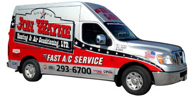 With a name like Jon Wayne Service Company, you'd better have a look that's big and bold that will make a lasting impression.
"One of the most important elements of our fleet design is the prominence given to our name on the trucks," says Don Rackler, president of the San Antonio company. "It makes it easy for potential customers to remember our name and raises awareness of our company."
The design for the company's 93 Chevy, Dodge and Nissan trucks and vans evolved over time — and was done entirely in-house.
"It started with the design for our business cards," Rackler says. "Then, as we grew and evolved as a company, the design was carried through to many other aspects of our identity, including our trucks, even as the design itself evolved."
The second most important element customers notice about Jon Wayne Service Company's fleet is that they're always clean and presentable. Rackler says this gives both current and potential customer's confidence that they'll perform solid, reliable work and be as clean and careful as possible in their homes.
"My singular goal is to provide the area's finest services, products and customer care with honesty and integrity," he says. "We built a sound and stable business by always trying to do the right thing and keeping our customers' best interest at heart."
Rackler uses a lot of the features on the trucks in the company's advertising and branding, and notes that the trucks are either the first or second reasons people call.
"We've recently made versions of the wraps for the plumbing and electrical trucks as we've added those services," he says. "They're not considered part of our fleet unless they're wrapped.
"Everybody likes them … they're very distinctive," he continues. "The guys driving them feel a sense of pride and the name Jon Wayne sticks with people, most definitely."
RUNNERS UP
Colorado Climate Maintenance
Englewood, Colo. | 18 vehicles
Sam DeAngelis, CEO
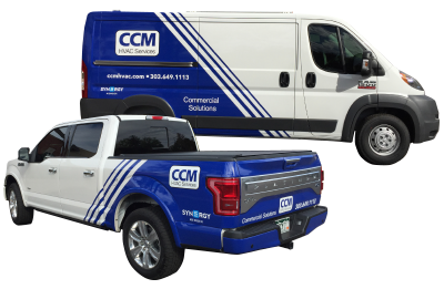 Over the years, the Tops in Trucks winners and runners up have been largely residential contractors. Recently, however, more and more commercial companies are using their fleet to boost their image — but they're doing it differently. Such is the case with Colorado Climate Maintenance (CCM).
"Residential contractors need to have almost an information overload — like a billboard — on their trucks, listing everything they do and how to get in touch with them," says Sam DeAngelis, CEO of the Englewood, Colo. company. "It's an effective way to communicate with the end-user. But, since we don't do any residential work — we're commercial only — we wanted to make it more of a branding identity than an advertisement."
DeAngelis wants CCM's fleet of 18 Dodge and Ford vans and trucks to be recognized because of the logo and colors, which align well with all it's branding.
"Clean, simple and identifiable enough so when we're at buildings people know we're there," he says. "Our uniforms match as well. People identify that image with who we are and that started quickly once the vans were wrapped."
CCM has had the same style since it rebranded in 2011. Once DeAngelis created the new logo and branding on CCM's website and business cards, he had a wrap company come up with a design for his fleet.
"Our insurance agent, who is right down the road from us, called a few months after we had the wraps done," DeAngelis laughs, "and asked if we had to up our insurance because we had so many more trucks on the road. They just don't blend in anymore!"
Schultheis Bros.
Pittsburgh | 54 vehicles
Richard Schultheis, owner
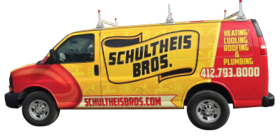 When a company has been around for 70 years, implementing change can be difficult — especially when it comes to the look of the company's brand. But, if you've proudly emblazoned your fleet with bright yellow and red from day one, refreshing the look can go smoothly.
"We redid our trucks last year, but kept the same colors, and put a modern twist on it," says Katie Rullo, marketing coordinator for Schultheis Bros. "We wanted to keep it similar, because we get a lot of calls as a result of our yellow and red trucks."
Rullo is the granddaughter of 94-year-old Richard Schultheis, who founded the Pittsburgh company in 1946 with his brother Bill Schultheis, and still owns the company today. Started as a roofing company, Schultheis Bros. added heating, then cooling and, most recently, plumbing.
"Everything has evolved from the wrap design to remarket the brand," says Rullo. "We started plumbing four years ago, and as it's gotten stronger we felt we should give it as much prominence as roofing and HVAC. We're a total home service provider."
Rullo notes that approximately three-fourths of the company's 54 Chevy vans, trucks and HHRs are wrapped already, and the rest will be wrapped as they replace them.
"The trucks are certainly attention-grabbing," she says. "We get many calls and emails about them and the number one question is always, 'Why did you choose those colors?'"
The answer is simple, Rullo says — Richard picked red and yellow to honor his high school basketball team.
Smoak's Comfort Control
Charleston, S.C. | 20 vehicles
William Smoak, president & GM
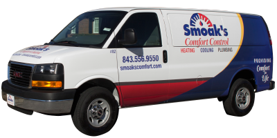 Founded in 1972 by Jack Smoak, Smoak's Comfort Control has provided customers in and around the Charleston, S.C. area "Comfort for Life" for over four decades.
Though Jack is gone, his two sons, William and Glenn, carry on the same customer-focused goals on which Jack originally founded Smoak's Comfort Control — and that includes making their company visible in the area.
"People around town have definitely mentioned seeing our trucks when our sales team introduces themselves at community events," William Smoak says. "They love that the vehicles really stand out. They can see us coming!"
Smoak's fleet of seven GM vans and box trucks feature a clean design with a refreshing take on the classic red and blue color scheme. Featured prominently is the company's logo — a representation of a thermostat with the name Smoak's taking center stage.
"We wanted to incorporate elements of our logo into the fleet design, but on a larger scale," Smoak says. "The big blocks of color really help get attention and show of our logo."
The logo has been a familiar site around Charleston, featured on everything Smoak's does, from advertising, website and business cards to company uniforms. And now, that well-known image has even greater visibility on the fleet — making Smoak's a household name.
Universal Heating & Cooling
Goodlettsville, Tenn. | 6 vehicles
Tonya Collins, co-owner
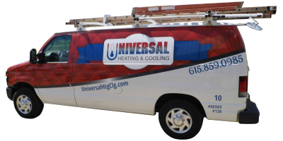 When you're a smaller, family company, it can sometimes be difficult to compete with the "big boys." Often, the solution is simply to be seen.
"When our truck is seen, we're viewed as one of the top dogs," says Tonya Collins, co-owner of Universal Heating & Cooling outside Nashville, Tenn. "When our technician took the new truck out for the first time, he said he got a lot of jealous looks from some of the larger companies. He was very proud."
Collins and her sister run the company, which was founded by their parents in 1976.
"We've grown in the replacement market, away from new construction," she says. "The visibility of our trucks has really helped with that."
Universal Heating & Cooling used to be 70/30 new construction, but Collins notes that now they're 80/20 residential replacement.
"We're not seen as a small company anymore," she says. "We're family owned, and want to give our customers that family experience, but we also want to be seen as a company that can compete with the larger companies.
"We can do anything they can do, and customer service wise, we do it better," she continues.
In 2014, Universal Heating & Cooling hired a marketing firm to redo it's website and update it's logo. After that, they came up with the wrap when they bought a new van.
"They did this design on our first van two years ago and we loved it," Collins says. "They've done a really good job. As we added new vehicles, we've wrapped them as well."
Collins notes that the red diamond pattern on the company's six Ford and Ram vans and trucks makes people think of a quilt, like they're wrapping them in comfort.
"It really makes us stick out more than just our name on the side, when we're driving down the road," she says. "We're getting all new uniforms too with the updated design. Everything will be consistent with the new branding."

 Pete Grasso is the editor of HVACR Business magazine. To download an entry form for the 2017 Tops in Trucks fleet design contest, visit hvacrbusiness.com/topsintrucks.


 Marty Rosica, owner of
  Throughout the years, many HVACR companies have used the traditional red and blue color scheme to represent hot and cold, as well as some embodiment of a sun and snowflake.
 With a name like
  Over the years, the Tops in Trucks winners and runners up have been largely residential contractors. Recently, however, more and more commercial companies are using their fleet to boost their image — but they're doing it differently. Such is the case with
  When a company has been around for 70 years, implementing change can be difficult — especially when it comes to the look of the company's brand. But, if you've proudly emblazoned your fleet with bright yellow and red from day one, refreshing the look can go smoothly.
 Founded in 1972 by Jack Smoak,
  When you're a smaller, family company, it can sometimes be difficult to compete with the "big boys." Often, the solution is simply to be seen.
 Pete Grasso is the editor of HVACR Business magazine. To download an entry form for the 2017 Tops in Trucks fleet design contest, visit