It's everywhere. Consider in the U.S. alone, approximately $200 billion will be spent on all forms of advertising this year. It's inevitable there's going to be a lot of bad mixed in with the good.
There are 36 companies that spend more than $1 billion each — and yes, they've all earned a little spot in the back of your brain, that's called brand awareness.
For the first time ever, Apple spent a little more than a billion dollars on advertising, and they were in 36th place on the list. Warren Buffet's Berkshire Hathaway's spends $1.39 billion, with GEICO accounting for $680 million on television ads alone. Jumping up to the $2 billion dollar spenders, Time Warner ranks 12th on the list. Verizon comes in at third place with $2.5 billion, General Motors is second at $3.1 billion and Proctor & Gamble claims first place with $4.9 billion (globally, they spend $10 billion — about $30 million every day).
If you Google "bad advertising" it will return just north of 309 million examples, everything from bad campaigns to slogans. But, I'm not talking about distasteful or offensive advertising; I'm talking about poorly executed advertising — and HVACR contractors are not immune.
I returned home from an extended trip recently and began to sort through a pile of mail. I pulled out, roughly, a dozen local flyers, community lifestyle magazines, coupon books and the like.
The good news is contractors are advertising, but the execution stinks. Three ads caught my eye, all for the wrong reasons.

Click to enlarge
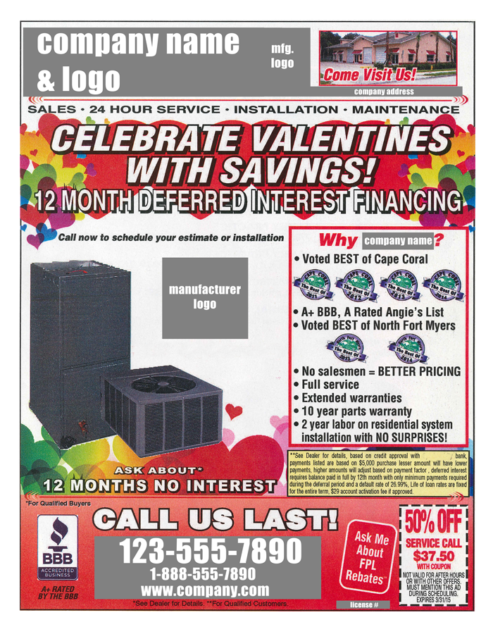
The first is a full-page ad with a Valentine's Day theme and that's the first problem. The ad is broken into six sections and my eyeballs bounced around the page like a pinball. I don't know where to look: the Valentine hearts, the condensing unit, the furnace, the BBB logo, the coupons, the disclaimer in a yellow box … wait, there are three more boxes, one with a picture of their office, the "Voted Best" box and another for "Half-off a Service Call."
Too much to take in. This ad has 23 different fonts and/or sizes, 14 separate messages, no clear starting or exit point and a color scheme that includes red, yellow, purple, green, blue and black. I almost get seasick looking at it.

Click to enlarge
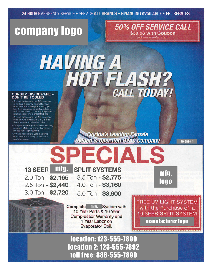
Ad No. 2 is also a full page. At the top of the ad, the company's logo shares equal billing with a red coupon box announcing "50% Off a Service Call." The top half of the ad features a sweaty young man with his shirt off and his underwear showing, flexing his six-pack abs. The copy reads, "Having A Hot Flash? Call Today."
The bottom half of the ad features "SPECIALS" that list pricing for six different split systems ranging from 2- to 5-ton. Mind you, there is no mention of a website. In all, this ad has 16 different fonts and/or sizes, seven different messages and a red, white and blue color scheme — all with a sad attempt to use hot flashes and sex as the main draw.

Click to enlarge
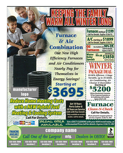
Finally, Ad No. 3 is a third of a page. The headline reads "Keeping The Family Warm All Winter Long" accompanied by a cute family of four on a couch. The body copy highlights a furnace and air combo with the manufacturer's logo and picture of the unit.
At the bottom of the page is a nice company logo with all seven of their locations and phone numbers. So far, so good. In fact, this would have been a good place to stop … but no, they jam in six coupons on right-hand side and, out of nowhere, on the bottom left is a blurb in yellow about a hybrid system. There's also the obligatory BBB logo and a black box with very small type about parts, labor and warranty. Again, no mention of a website. This ad has 13 separate messages and 24 different fonts and/or sizes. The color scheme is red, light green, dark green, yellow and several shades of blue.
Ladies and gentleman, you can do better — much better.
Let's recall just four of the Ten Commandments of Good Advertising:
1. One component should dominate the advertising area; 99 percent of the time this is a graphic.
2. A strong headline is the second most important element and, together with a compelling graphic, they stop your audience long enough for them to investigate.
3. Tightly worded text will quickly bring the reader into the ad and keep them reading. Avoid clutter, multiple fonts and font sizes. Stop with the coupons already — or, if you must, just use one.
4. Advertising is a solution in search of a problem. Your ad is looking for prospects that have one with their HVACR system.
Local advertising agencies would welcome your business with open arms. Or call me — we'd be glad to design a campaign that will help you attract the customers you're seeking.


