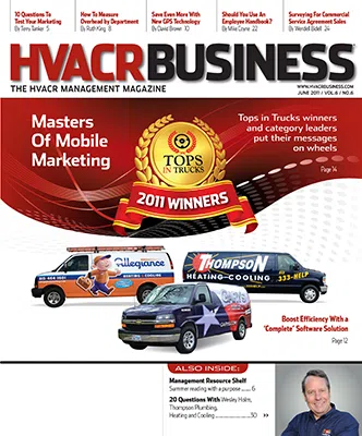
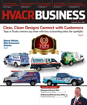
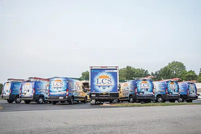
When you think of mobile marketing, what comes to mind? These days, you’ll probably think of Twitter, mobile-device apps, and social media updates. But one of the most powerful mobile marketing tools HVACR contractors have is their fleet. Your trucks, vans, and cars are on the road almost every day being seen by thousands of motorists, neighbors, and by passers-by. And unlike digital messaging, fleet marketing has a proven record of bringing in sales, has an immediate impact, and is a better format to convey a unique branding message. Differentiation is more difficult in the crowded and swiftly moving digital world.
HVACR Business believes fleet marketing to be too good of a promotional opportunity for any contractor to ignore. Our readers who lead in their markets have told us repeatedly that fleet marketing is one of the most effective tools with the highest ROI in their marketing plan. That’s why each year we pick three contractors who are leaders in fleet marketing as winners in our Tops in Trucks contest. This year’s winners are three companies with fantastic-looking fleets that also support the branding and value proposition of each contractor.
Allegiance Heating & Cooling
Mokena, IL • 12 vehicles
Allegiance’s new design is the result of a re-branding effort. The 11-employee company has been serving the Chicago suburbs for 12 years; so changing their logo and style was not an easy decision, according to Brian S. Cusack, project manager. The positive results, however, have been beyond their expectations, Cusack said.
“Our old logo just seemed to blend in with all of the other construction vehicles on the streets,” he said. “But this has been great. The new design has been on the streets only a couple of weeks, and we have had a much greater response than we expected.”
Cusack said the company had a specific idea for a Claymation-style depiction of a contractor as well as which colors to use. Their next step was to find a graphics company to make it happen. Ultimately, they chose Graphic-D Signs Inc., Robbinsville, NJ, and are very happy with the results; but this wouldn’t have happened without some purposeful research beforehand.
“We talked to a lot of different [HVACR] companies that used them. Some had a 10% increase in sales the first year after a new design, and others had as much as a 35% increase.”
The company also researched wrap companies carefully and ultimately chose Freedom Design & Decals Vehicle Wrap Specialists in Mokena.
Cusack said the resulting depiction is more two-dimensional than Claymation, but that it evolved through collaboration with the design team.
The Tops in Trucks judges identified Allegiance’s design immediately as a standout because of its cleanliness, simplicity, and unique imagery. While contractors sometimes put images of real people in their fleet designs, this is not something that is unique because most humans have the same basic look. By contrast, a unique cartoon depiction will garner much more attention. Additionally, Allegiance avoided overcrowding the space with too much type, which makes the service tech image stand out even more.
“Customers tell us the new design has a warm, comfortable feeling,” Cusack said. “The wrap gets our point across and is very easy to read.”
Gary’s Heating and Air Conditioning Inc.
Amarillo, TX • 11 vehicles
Flags are probably the most reproduced item in HVACR contractors’ fleets outside of equipment. Who doesn’t get a warm feeling when they see a U.S. flag? Problem is, it’s difficult to make a connection between patriotism and heating and cooling in a fleet design, and even more difficult to use flags to motivate potential customers to call for service or installation. Flag designs usually come off as unsophisticated or “borrowed.” This is why none of our past Tops in Trucks winners have had flag-focused designs.
This year though, Gary’s Heating and Air Conditioning Inc. gets the nod. This flag design is unique and successful for two major reasons:
1) Gary’s customers are Texans, and in Texas, love of state is the de facto religion. No other state flag would carry as much meaning and get as much attention as the flag of the Lone Star State.
2) The company didn’t overdue the loveof- state angle. They let the flag closeup speak for itself rather than adding cheesy sayings about how great Texas is. Instead, two very important type messages appear — the company’s website URL and its unique selling proposition, “Fixed Right or It’s Free.”®
“We know that this proposition is something that separates us from the competition, and we feel if the client sees our name, and the distinct difference between us and the others, they’ll remember us,” said Gary Ward, owner of the 33-year-old family company.
“Another big point is that I involved many of my employees in the conceptual and final design process. I wanted them to have ownership, and that worked out as I had hoped. When they hear compliments, especially from competitors, they are very proud.”
Ward purposefully did not list the company’s phone number prominently in the design. It is only on the backside. His company conducted a short survey on how often people write down phone numbers they see on service vehicles and found that only about 10% of people do. So, they opted to prominently display the company’s website address instead. “
We make a big point in our advertising to drive people to our website — which is only about us — as opposed to the phone book, which has all of our competitors as well.”
Driving traffic to a website also makes that investment go farther. Gary’s is taking an even bigger step for improving ROI by using pictures of its trucks on its website, on postcard mailings, and on door hangers that they give to customers.
Thompson Plumbing, Heating and Cooling
Cincinnati, OH • 63 vehicles
The business generated by customers seeing vehicles puts fleet marketing in the top 10 of lead generators for Thompson Heating and Cooling. The company said its fleet is the only blue one among competitors, and having its branded phone number (513-333- HELP) also sets the fleet apart.
It’s all part of a larger, strategically constructed marketing plan that also includes extensive online marketing, and broadcast advertising. All of the elements work together to make Thompson’s marketing a success.
“Technicians report that when they drive around town, people will sing our jingle back to them,” said owner Wesley Holm. “Our trucks can be identified from all angles, so if we drive past you, are in front or behind you, you will know it is Thompson.”
The company also emphasizes clean and well-maintained vehicles, and has a full-time fleet manager who can be working on up to three vehicles at a time.
The Tops in Trucks judges liked the comfortable, straightforward feel of the Thomspon design — perfect for its Southern Ohio/North Kentucky market. The design is also clean and bright thanks to bright white lettering and a minimal number of colors.
To learn more about Thompson’s fleet and other marketing success, see this month’s Tops in Trucks interview with Holm.
Best Use of Aminals
Over the years, we have seen dozens of animal mascots on service fleets, and frankly, most are not well designed. They are either too small to be recognized from a distance, have an amateurish look, or don’t seem to represent any known species.
That’s why this year we are pleased to show two contractors that did a great job incorporating animals in their fleet designs.
Popa Heating & Cooling
Highland, IN • 7 vehicles, 1 trailer
Popa Heating & Cooling’s design incorporates the company’s mascot “Pompy the Polar Bear,” who also appears in the logo. The design is successful because Popa went big — Pompy is such a dominant feature of the design that it immediately brands the trucks and plants a visual cue in the viewer’s mind that connects what they are seeing to Popa. Also, the bear design is simple. There’s no mistaking what you’re looking at. Using a minimal number of colors also gives the vehicles a clean, monochromatic look.
William C. Fox Heating & Air Conditioning Inc.
Edgewater Park, NJ • 6 vehicles
This design succeeds for the opposite reason. The company’s foxy logo is more than 30 years old, and so it has built-in traction. They made the right decision in keeping the friendly fox mascot and limiting it to a modest perch above the William C. Fox name. The understated use of the fox is a perfect balance to the multiple type messages (Emergency Service!) and other design elements.
Best-Looking Back of Truck
The Filter Shop Inc.
Omaha, NE • 3 vehicles
As a wholesaler/distributor, The Filter Shop took a risk with its fun wrap design, which includes a clever filterclose- up on the back. As operations manager Mike Kieny pointed out in the application, “There’s no mistaking what we do.” Kieny also said competitors have plain vans with black lettering, and the company’s goal with this design was to stand out. It does.
Best Use of Color
Olympic Aire
White Plains, MD • 6 vehicles
Orange is the new blue when it comes to service fleets, and Olympic Aire is not only fashionable in its color choices but also wise. The company used shades that glow during the day and set off glow-inthe- dark lettering at night. The colors themselves are so bright that they attract attention on their own. .
Cleanest-Looking Fleet
Minnick’s
Laurel, MD • 18 vehicles
When Minnick’s redesigned its fleet in February, the company picked up on a popular color-combo trend for service vehicles — orange plus a primary color plus white — but what most impressed us was how clean-looking the company’s fleet is. The color scheme shows off the sheen of the sparkling-clean trucks, and yes, we did notice the extra detailing — all the way down to the tires.
Best Type Design
Comfort Solutions Inc.
Springfield, VA • 9 vehicles
What’s the goal of your fleet design? Answering this question will give you clues about what type of design to use. For Comfort Solutions, a “clean” fleet design was most important, and this type treatment successfully meets that goal. We like that the company incorporated a list of its services, an attractive logo and primary colors.
Best Wrap Design
A+ Heating & Cooling
Newburgh, IN • 5 vehicles
A+ gets an A+ for getting its money’s worth out of this wrap. Count the elements: bright blue sky, vibrant green grass, the Carrier logo, a heat pump, a geothermal message and loops, and a company report card. Throw in company name, phone number, and website address, and, it’s a wrap!
Best-Looking Box Truck
Boyer Refrigeration, Heating & Air Conditioning Inc.
Altoona, PA • 18 vehicles
Boyer serves both the commercial and residential markets, and its fleet design is one that works well in each. The company smartly carries the same design on install vehicles (box trucks) and service vehicles. Sometimes contractors don’t include box trucks in design planning, but this is a mistake. Every vehicle speaks volumes about your business. Consider what C. Scott Boyer had to say about this design: “One customer stated, ‘Any company that keeps their trucks this nice has got to do good work.’” Well said.
Tiger Air
Parma, OH • 6 vehicles
Another box design that we liked came from Tiger Air. The tiger stripes certainly stand out, and we like that they repeat on all sides of the truck. Use of minimal type was key to drawing out the stripes.
Best Display of Product(s)
Yes Heating and Air Conditioning
Olean, NY • 1 vehicle
Yes Heating and Air Conditioning managed to place five pieces of equipment in its wrap decision, including copper piping and a thermostat. This was a good idea because the company has only one vehicle, so with that constraint, loading up on product images works! Yes gets extra points for getting even more from its wrap investment. Says President Rob Granger, “We park the van near a major highway for the weekend to help advertise our business, which increases our ROI.”
Logan Heating & Air Conditioning
Winston-Salem, NC • 48 vehicles
We like this Logan design for the direct message about installing a WaterFurnace geothermal heat pump — “Save 70% on heating and cooling cost.” This striking statement gives more meaning to the product display.
Best Incorporation of Equipment Manufacturer
Rudy Uttke & Sons Inc.
Milwaukee, WI • 5 vehicles
Uttke’s design tells a story, and the Bryant man fits right in. A beautiful Milwaukee skyline sits below a Superman-style searchlight that calls for help via an RU insignia, the company’s logo. The Bryant super hero is poised at the back of the truck, ready to respond. The two elements — local contractor and well-known equipment producer — come together in this well-thought-out design. The company thankfully resisted just slapping on a Bryant logo!
Best Multi-Side Design
F.F. Kling & Sons Inc.
Manchester, PA • 18 vehicles
Fleet vehicles are like runway models — a pretty face is not enough. They need a good profile and an eye-catching backside. F.F. Kling’s design covers every side of each truck with vital information. There’s so much type on these trucks that they transcend the typical comparison of a well-designed fleet truck — “billboard on wheels.” These trucks are pamphlets on wheels.
Tonya Vinas is a former editor of HVACR Business.


