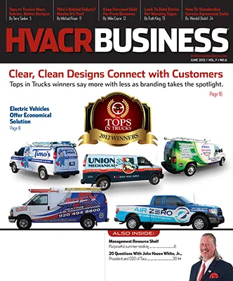
How do you convince strangers to invite you into their home, allow you to tinker with their expensive equipment, and then have them write you a check? All without meeting them or talking to them?
It’s all about reputation. One way hvacr contractors communicate their trustworthiness, technical ability, and quality customer service is through their trucks. Company owners who still do not see their fleets as one of the top communication tools and ways to gain customer confidence need to listen to the winners of this year’s Tops In Trucks contest.
“The number of converted-to-sales leads due to our fleet recognition ranks second only to leads produced by our service technicians,” said Read Frymire, president of Frymire Services Inc. of Dallas, winner in the Lettering Category.
Says Chuck Lynch, president of Quality Air, Wrap Category winner: “It’s by far the best advertising we have.”
HVACR Business holds the annual competition to recognize the efforts of companies that understand the importance of fleet appearance and invest time, effort, and money in achieving the best design strategies and communications for their companies.
Tops In Wraps: Quality Air, Asheville, N.C.
Two years ago, Quality Air President Chuck Lynch concluded that fleet design was the best place to put his advertising dollars. He already had a design that he liked, and he wanted to make it better.
He asked SignZoo, a Sarasota-based company that creates eye-catching wrap designs for trucks, boats, and wall murals, to enhance the impact of Quality Air’s fleet design. The result is a fleet that grabs so much attention that 60% to 70% of Quality Air’s sales calls come as a result of someone seeing one of the fleet vehicles, Lynch said.
Quality Air’s fleet includes pick-up trucks, vans, and cars. HVACR Business judges liked the fact that the designs varied slightly per vehicle type but maintained a consistent visual theme. This is achieved through consistency of colors (red, white, blue), typeface, and motif (a starburst).
The design is simple and clearly communicates the name of the company and how to reach them. Some wrap designs the judges considered looked impressive, but they lost points on functionality because the designs were overwhelming and distracted from the most important information — company name and contact information. The Quality Air design grabs attention without being overwhelming, yet, it’s attractive and interesting enough to always make an impression.
“Think about the time your trucks spend on the road — whether on a job, picking up material or grabbing lunch — your custom fleet ... is out there letting prospective customers know about your business,” according to SignZoo, which provides its services nationally through certified installers. “Your vehicle graphics can generate up to 16 million impressions a year!”
Tops in Manufacturer- Sponsored Design: Stoudenmire Heating and Air Conditioning
Stoudenmire Heating and Air Conditioning of Columbia, S.C., has been selling Bryant equipment for more than 30 years, so when it came time to update the look of some of its trucks, company owner Mike Gatlin decided to take advantage of the manufacturer’s fleet designs. He chose two wraps that display the Bryant “superhero” towering over a city skyline at sunset in one version and at twilight in another. The trucks also prominently display the Bryant logo and slogan: “Whatever it Takes.” To that design, the company added its name and phone number in black lettering with a white shadow.
“It turns people’s heads for sure,” Gatlin said.
Currently, seven of the company’s 10 vehicles have the wraps, and Gatlin said he will be updating the remaining three shortly.
In addition to the financial benefits of going with a manufacturersponsored wrap (the cost is subsidized by the manufacturer), the design suits Stoudenmire because the company installs many high-end residential systems, Gatlin said. Because of this, technicians spend a lot of time discussing the benefits and quality of the equipment they install. When they tell clients that the Bryant line is associated with Carrier, it instills confidence and trust.
Tops in Lettering: Frymire Services Inc.
Why mess with a good thing? Just make it better.
That is the design philosophy of Frymire Services Inc. when it comes to the company’s 90-vehicle fleet. In a recent redesign, company president Read Frymire took an active role in updating the well-known yellow-and black trucks that have been serving the Dallas area for 60 years. The goal was to modernize the fleet appearance while maintaining elements of design that have clearly become part of the company’s branding.
“The previous design had been in use for 15 years, and it was time for an update,” Frymire said. “Our trucks are a very important part of our branding. People might not know of everything that we do, but they know our trucks.”
The redesign included dropping the word “Services” and a logo on the sides of the trucks to make room for a larger-size type spelling out Frymire, which is in black letters on a yellow box. The yellow-and-black motif is also part of the Frymire branding legacy and is what makes the retro-’70s type design “pop.” The Frymire name appears on the back and sides. The company name and number — as well as a silver/white band — is in reflective paint.
Frymire Services has used yellow in its design since the 1950s when Read Frymire’s father founded the company, and the color is so much associated with Frymire that a competitor in the area recently painted his fleet yellow.
“My father wanted a truck that would get noticed, and he knew he was too much of a man to use pink,” Frymire explains.
Frymire began the redesign process with internal brainstorming and discussions. When they had a good idea of what they wanted, the company went to an adverting agency for more input and refinement, and finally turned to its fleet-graphics company for the final design. Before the final changes, though, Frymire “tested” various designs by putting temporary “cut-out” designs on a truck and looking at it from different angles and distances. The end result is the current design, which has received hundreds of positive comments from customers and prospects, the company says.
“Our opinion is that less is more,” Frymire says. “Because the majority of impressions are made when the van is in motion.”
Tonya Vinas is a former editor of HVACR Business.


